How Infographics Help to Engage and Educate Your Audience
Whether you’re a teacher, a marketer, or have pretty much any job that involves working with people, there are going to be many times where you are going to have to communicate complex or large amounts of information to engage and educate your audience.
The average human attention span lastszzzzzzzz……sorry, we meant to say 8 seconds! The point is, by the time you reach the end of this paragraph, most people would already have lost interest. Not great if you’re looking to persuade them to buy your product or learn a new topic.
Enter infographics: a visual presentation of your information that is digestible, easy-to-understand and can communicate your key messages more effectively than regular ol’ text. Here’s how.
It highlights the important bits
Of course everything in that 50-page report you wrote is important. But let’s face it, some things are more important to know than others – and these are things you’ll want your audience to take home.
Using an infographic instead or paragraphs of text means you can get straight to the point, and shed the word count in the process.
It increases information retention
Not only do infographics hone in on the most important information, but the use of visuals actually help to increase retention of that information.
This is because humans can remember up to 80% of what they see, but just 20% of what they read. Our visual memory is so strong that at times we can even identify incomplete visual elements (we love playing guess the logo game!).

Using appropriate icons or imagery with text therefore helps with memory recall.
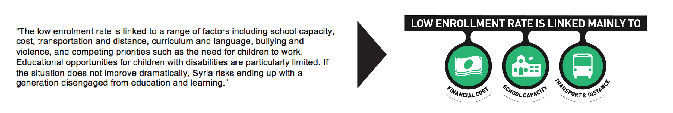
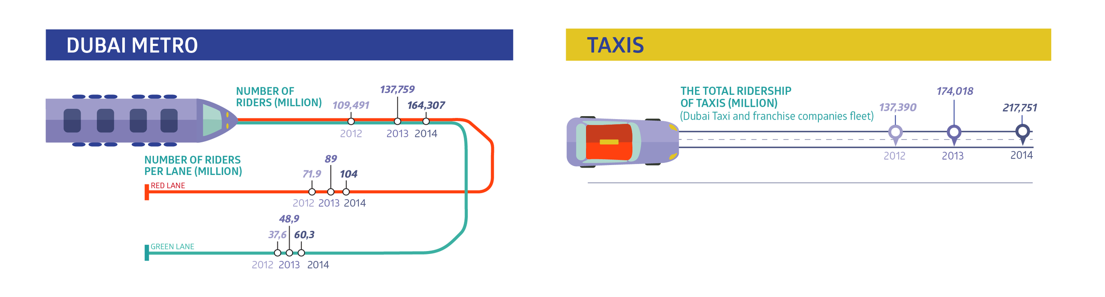
It makes statistics understandable
Statistics presented in tables or text make it difficult to analyze data or read trends (and, frankly, are a complete snoozefest).
This is where infographics really shine, as you can show multiple statistics together in a way that is really clear and simply laid out. You’re still presenting a lot of information, but it’s much easier to identify trends and outliers.
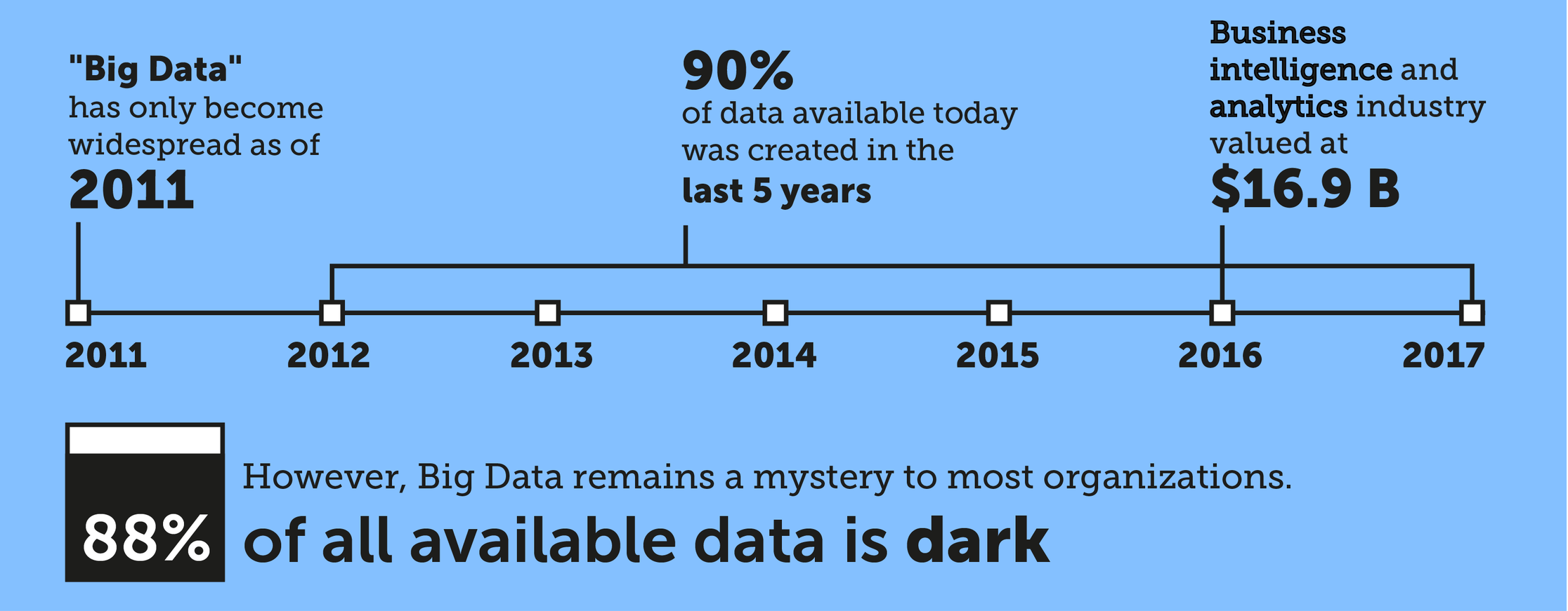
It breaks down difficult concepts
Using an infographic format can help to explain difficult concepts like big data really simply, and also works well for visualizing processes or timelines.
Infographics make a powerful tool when it comes to communicating with your audience, so next time you find yourself working on a report or presentation, cut down the writing and start visualizing!
At Infographic.ly, we’re obsessed with helping clients communicate their information more effectively – get in touch and see what our data design whizzkids can do for you.